May 15, 2023
, in design
Innovation, continuity and lightness – the three dimensions of Eidosmedia’s new look
Eidosmedia’s visual identity is undergoing a major makeover. What are the ideas behind it?
New visual identity | Eidosmedia
The combination of innovation with continuity, of new ideas with established principles has always been essential to keeping customers’ operations at the forefront of technical change. This dual nature of the company’s mission is at the heart of the new graphic identity.
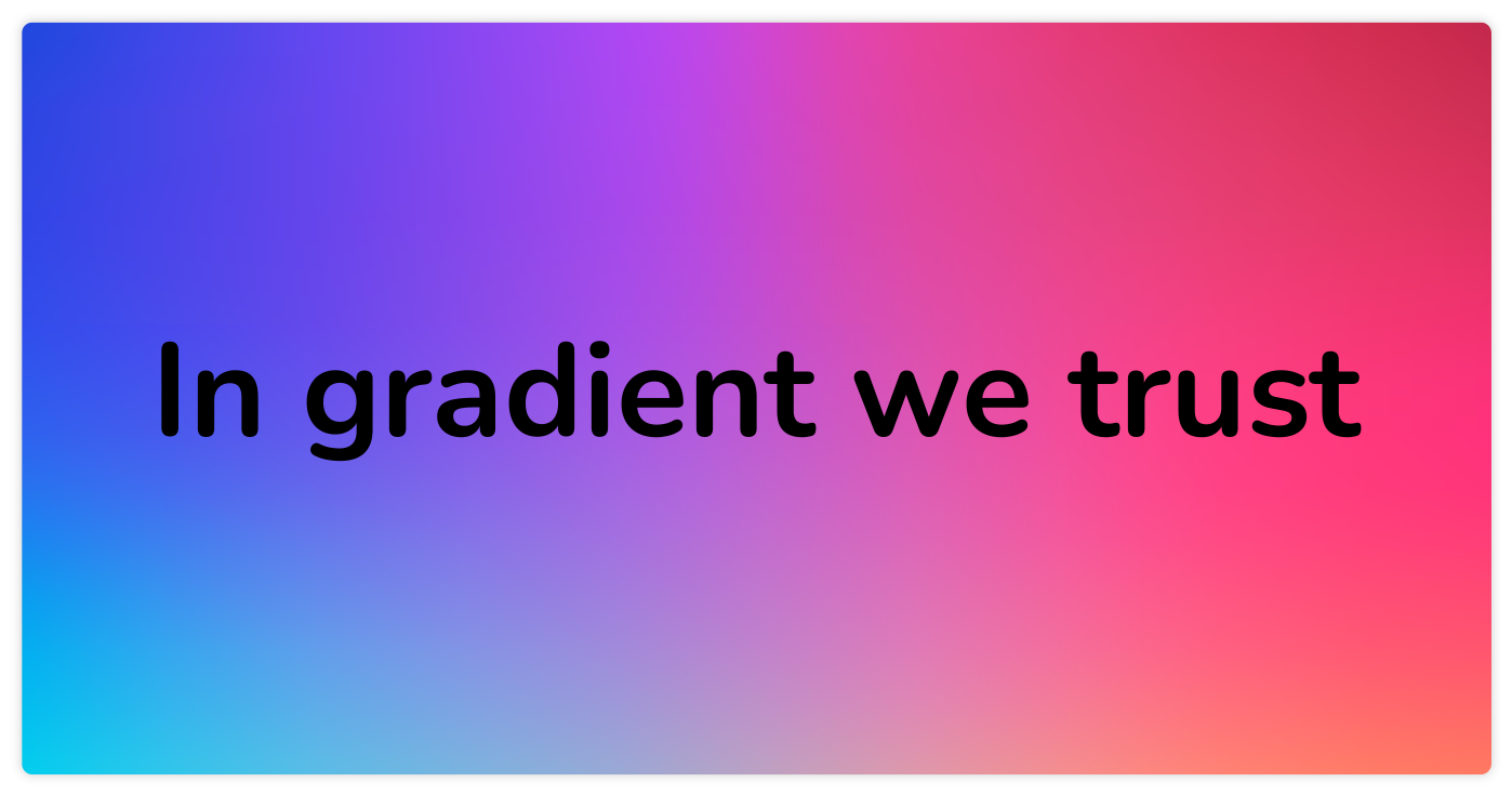
Starting with the colors
The process begins with the color palette. To the blue which has always been the company’s institutional color, we’ve added a vibrant, dynamic shade: Viva Magenta – the Pantone Color of the Year for 2023.
“Viva Magenta is brave and fearless, a pulsating color whose exuberance promotes a joyous and optimistic celebration, writing a new narrative.”
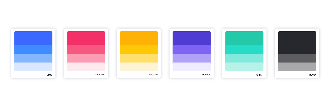
The new color perfectly symbolizes the energy and dynamism of the new technologies Eidosmedia is harnessing. Its use in a gradient solution with the institutional blue combines the two values and their complements in a unified chromatic harmony:
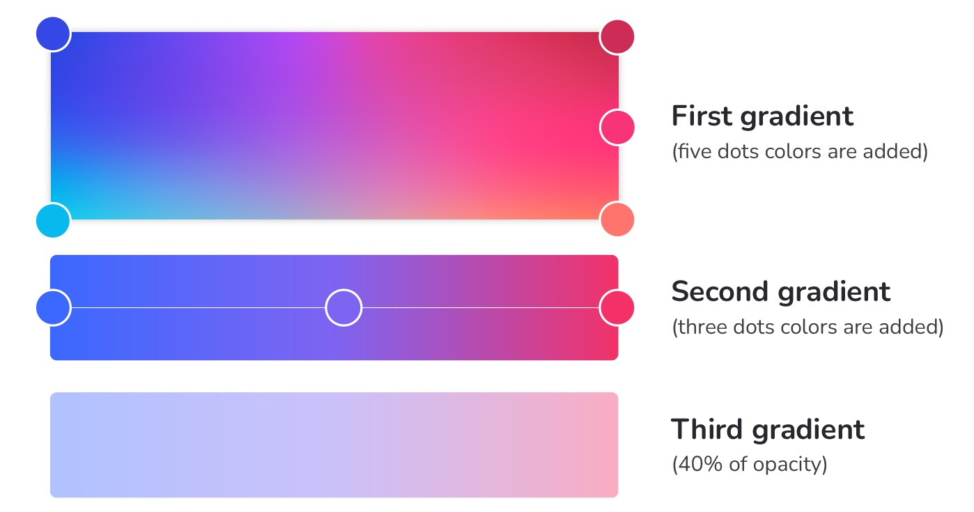
This color space also contains a sub-variant to be used for communications towards the Financial sector …
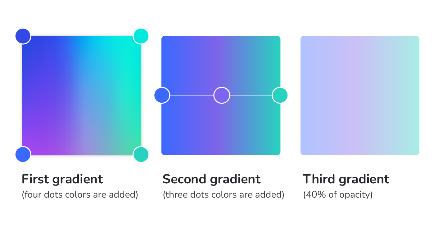
… as well as a chromatic family that can be deployed in the various graphical contexts in digital and print communications.
Lightness in the cloud
The third value that has most characterized the evolution of EM solutions in the last few years is the quality of ‘lightness’.
This is reflected in two important developments.
- Cloud-hosted SaaS deployments have replaced the ‘heavy metal’ of on-premise server hardware, lightening both the physical and capital burdens of the customer installation.
- At the same time, the move towards browser-based client software of the Swing family has lightened the installed load on client machines and devices, hastening the ‘zero footprint’ model.
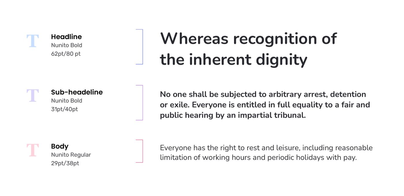
Lightness in the logo
As well as the chromatic gradients outlined above, the theme of lightness finds its expression in a new set of typefaces – including a subtle change to the brand logo itself:
Lightness in the fonts
The soft lines of the new logo are a reflection of a new rounded font family, Nunito ..
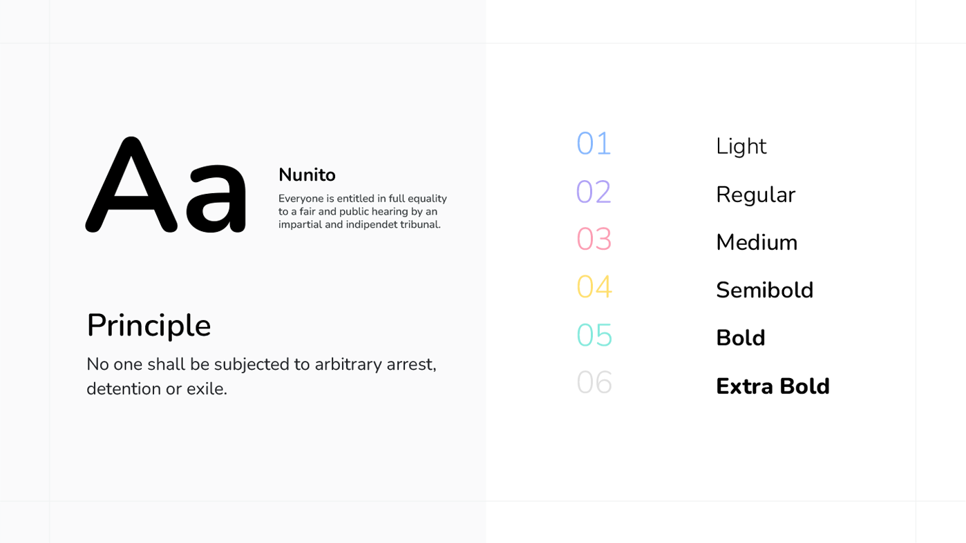
…to be used in both headlines and body text:
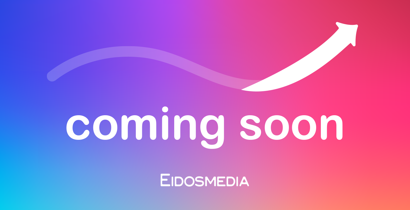
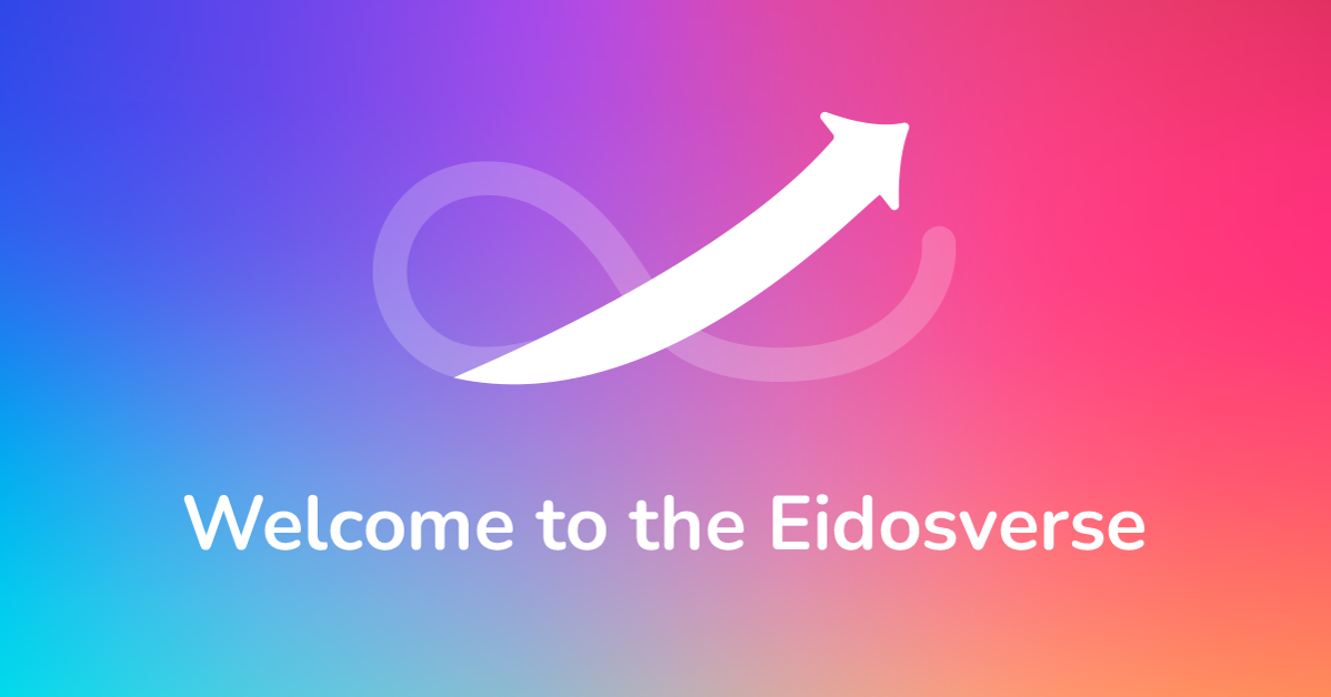
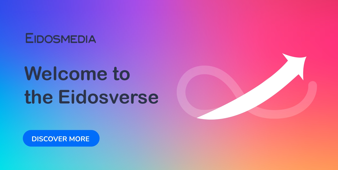
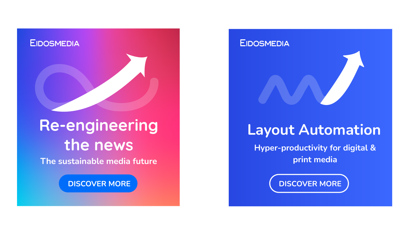
Soft dynamics - ribbons and arrows
The color gradient backgrounds defined by the new palette also lend themselves to ‘soft’ dynamic elements in the form of twisting ribbons and arrows that impart a subtle sense of movement and dynamism, without being overwhelming or intrusive.
Putting it together – icons, infographics and advertising
Combining the new color palette with the graphics motifs allows a range of elements to be generated across a wide range of color values, but sharing a common chromatic and geometric family resemblance.
The addition of a library of human figures generates a visual language that can express a wide variety of business concepts within a homogeneous and versatile visual repertoire.

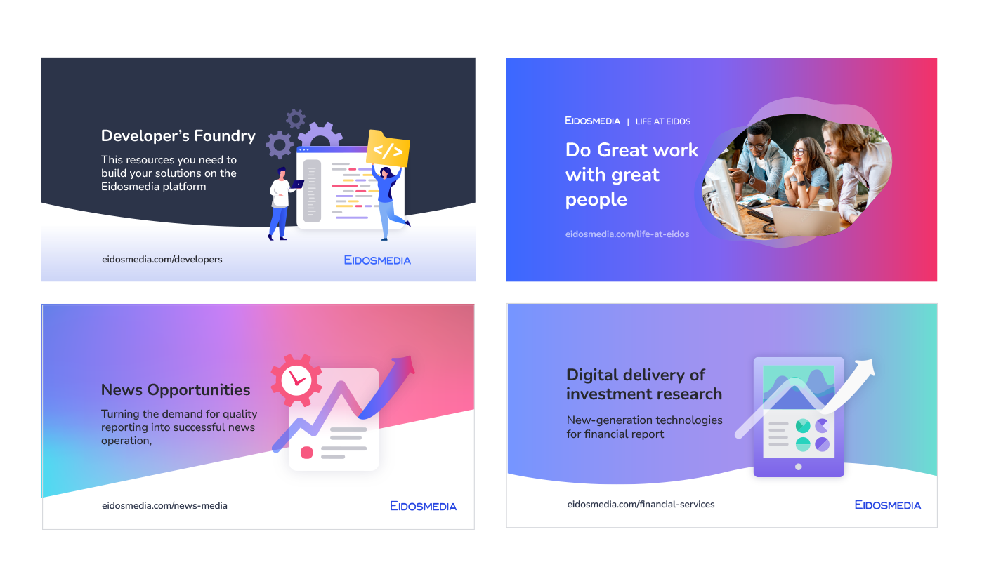
A recognizable corporate identity
For external communications in the context of digital and print media and events, we now have a coherent visual language, allowing the company to express a recognizable identity and values across multiple channels and domains:
Internal communications
In addition to the external public, the people making up the company’s human resources are important audiences for the presentation of the company’s vision and initiatives.
The new look therefore includes extensive guidelines for the creation of internal communications towards the workforce, with chromatic ranges dedicated to specific value sets:
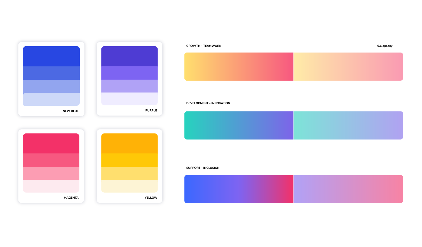
Expressing community values
Here too, the color palette generates icons, infographics and other elements of a visual language aimed at conveying the company’s essential values, such as teamwork and support.
As well as existing employees, a fundamental focus here is on potential new recruits who are seeking a supportive work environment whose values reflect their own need for respect and inclusion.

Sound branding, too!
But identity can be expressed through more channels than just the visual.
The makeover also includes a sound element.
Here too, we combine two contrasting elements: an opening motif, expanding towards new possibilities and horizons, followed by a harmonic resolution conveying a sense of completion and closure.
The sound brand will be used to sign off all of the company’s video and audio productions. Together with the visual library, it will give a powerful institutional character to the company’s presence across multiple digital and media spaces.