June 20, 2022
, in technology
Using Data to Tell Stories - How to Create Effective Data Visualizations
As sources of rich data for journalism become increasingly available, a growing number of tools allow journalists to convert that raw material into compelling visual displays. At their best, such visualizations give readers deep insight into the reality behind the story.

Data Visualization | Eidosmedia
Digital media has changed a lot about the way people gather, report, and consume the news. While publishers may find plenty to lament about in the wake of the digital revolution, the possibilities created by technology have made it possible for media companies to reimagine how they compile and present the facts.
Nowhere are those changes more evident than in data journalism (see our previous post Has Data JoHas Data Journalism Delivered?urnalism Delivered? ). Not only has the advent — and accessibility — of artificial intelligence (AI) and machine learning made it possible for reporters to dig through massive data sets and document dumps to inform their stories, but tech has made it possible to present the story in new ways.
More importantly, perhaps, are the interactive nature of visualizations. More than almost any other medium (yes, even more than video!) interactive visualizations have the ability to engage readers, draw them into the story, and invite them to explore.
Gone are the days of using static print and flat images to try and convey the intricacies of stories. Today, visualizations are as important to telling good stories as the data behind them. As writing teachers the world over have told aspiring scribes, “Show don’t tell!”. An effective data visualization does just that — but how do you know when a visualization enhances the story and is not just a gimmick? Let’s explore.
What makes an effective data visualization?
“Above all else, visualizations — when done right — are a vehicle of clarification and truth,” as Alberto Cairo, the Knight Chair of Visual Journalism at the University of Miami School of Communication, told Microsoft Story Labs, And in the 21st century, they are often more than just a visual that accompanies the story — data visualizations can now tell the whole story.
“A well-designed data visualization can give viewers an immediate and profound impression, and cut through the clutter of a complex story to get right to the point,” according to Sarah Cohen, Professor & Knight Chair in Journalism Cronkite School of Journalism at Arizona State University, writing for DataJournalism.com. Interestingly, the data-driven nature of this type of presentation can also help drive home the simple facts in an impactful but unemotional way to help cut through the noise of increasingly polarized media landscapes.
What makes a good data visualization goes beyond aesthetics to clearly and concisely convey complicated information while also being memorable for viewers. Cohen writes, “Even after you’ve stopped looking at it, a good data vis gets into your head and leaves a lasting mental model of a fact, trend or process.” To illustrate these points, Cohen calls out an “animation distributed by tsunami researchers in December 2004, which showed cascading waves radiating outward from an Indonesian earthquake across the Indian Ocean, threatening millions of coastal residents in South Asia and East Africa.”
Ultimately, what makes a data visualization different than any other visual is that it provides added insight and helps to tell a story. It’s more than just an illustration. While data visualization has many applications, there are four instances in which they are particularly effective, according to Cohen.
Four ways to use data visualizations
- Showing change over time
- Comparing values
- Showing connections
- Tracing flows
Effective data visualization in action
Of course, the best way to talk about effective data visualization examples is to show them — and over the past couple of years, data visualization has become integral to the ongoing coverage of (and fight against) COVID-19.
COVID-19 Coverage
The New York Times’ homepage features a visual digest of the latest COVID hotspots, vaccination rates, and more. Users interested in learning more can click through to explore numbers in their own region, or follow the more global story. You can also see at a glance which numbers are rising or falling.
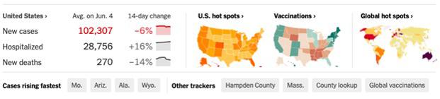
Rather than tasking reporters with having to write weekly — or even daily — COVID-19 stories about changing numbers, the visualization allows for ongoing coverage without overextending precious resources.
Illustrating climate change
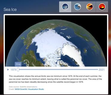
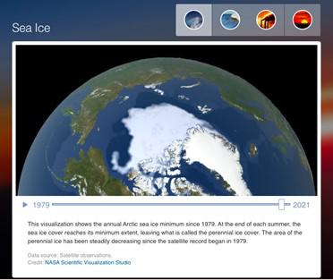
Data visualizations are not just the purview of journalists. NASA uses the power of visual tools to tell the story of climate change by letting viewers see how everything from sea ice to temperatures have changed over time. Rather than talk in abstracts about shrinking sea ice or rising sea levels, these visualizations allow people to see for themselves how the planet is changing — and impacting communities.
Best data visualization tools
While spreadsheets and some programming knowledge are often a data journalist’s best friends, dedicated tools can make the job easier.
There are a wide variety of applications available for every step of data visualization process and the International Consortium of Investigative Journalists have created a collection of links to the most popular.
Of course a visualization is only as good as the data used to generate it and there are also applications that speed up the cleaning and assembly of data into consistent sets suitable for subsequent exploration and presentation:
OpenRefine — OpenRefine ensures your data is written in a consistent format, has no duplicate values, or instances where data appears repeatedly. OpenRefine can help ensure your data is whipped into shape before data scientists start working with it.
Talend Studio — Talend Studio allows data scientists and journalists to build extract, transform, and load processes (ETL). With the help of predetermined rules, ETL takes data from its original location and converting it into one desired format before rewriting it to a new database. Talend speeds up this process.
Graphical user interfaces — A lack of programming knowledge does not mean an organization cannot employ data visualization. There are many tools that make this easier for design newbies.
Putting data visualization tools at authors’ fingertips
Eidosmedia platforms Méthode and Cobalt are frequently used to create data-rich content from specialized journalism to investment research. For this reason, allowing authors to access data handling tools from within the authoring workspace has been a priority.
As well as being able to pull charts and tables in from a standard office app like Excel, authors can also instantly embed visualizations created by standard open-source programming languages like R and Python.
The visualizations are automatically formatted for inclusion in any of the delivery products from mobile apps to web pages to PDF, making publishing data-rich content fast and efficient.
Find out more about R and Python integration in Eidosmedia platforms
Eidosmedia users can integrate their authoring space with other data visualization tools like Flourish and the other applications in Google’s Journalism Suite thanks to a universal framework known as External Object Linking (EOL). EOL can quickly and easily create interfaces between Eidosmedia workspaces and any standard external application.
